Portfolio. Adel Lein
Bē
✈
Download CV ↓
Robinzone · AI creative platform · Web
A clear way into creating
Robinzone brings 61 AI models from 10 providers into one subscription. Its homepage opened with two entry points that competed with each other: a hero with link cards and, below it, a working composer with 11 modes. I redesigned the first screen so a visitor understands the product, sees what they can make and starts creating right away.


6
competitors
analyzed
6
UX issues
found
5
iterations with AI
· 17 fixes
6
hypotheses
to validate
Context
Two entry points that compete
Product
Robinzone generates images, video and audio. The core tool is Creation Studio: pick a mode and a model, describe the result, hit Generate.
The audience is SMM specialists, bloggers, freelancers and small businesses, mostly without a technical background.
Problem
01 · Hero — a headline and three cards: Create Video, Creation Studio, Create Image. In practice, just links.
02 · Composer — the real working tool: 11 modes, prompt, settings, model choice and Generate. It sat one screen lower.
Goal
One first screen that does one job: the visitor understands what Robinzone is → sees what they can do → starts creating.
Desktop and mobile, with working mode switching, prompt input and model choice.
My role
Product Designer, end to end: product walkthrough, competitive analysis, hypotheses, UI for desktop and mobile, interactive prototype.
Approach
Observations → hypotheses → solution → next steps. Findings come from a walkthrough and competitive analysis, so each one is framed as a hypothesis to validate with users.
Current experience
Where it started
A headline and three product cards on the first screen; the composer with 11 tabs on the second. On mobile the same content stacked into a long scroll.

Desktop · before

Mobile · before
Process
From walkthrough to prototype
01
Walkthrough of the current first screen · desktop & mobile
02
Competitive analysis of 6 AI platforms · first screens, models, modes, prompt help
03
Audit of all 11 composer modes · files, prompt, settings, models, price
04
Observations → hypotheses for the entry point and the scenario
05
Screens generated with AI and refined by hand · 5 iterations, 17 fixes
06
Final desktop & mobile screens, interactive prototype, research plan
Competitive analysis
How competitors sell “every model in one place”
I looked at six AI platforms: how their first screen explains the product, where the models are, how modes are named and what the main call to action is.

Krea
“A new era”
A prompt field right in the hero — “Ask me to do anything…” — with the model set to Auto. Below: tasks paired with models, “Create images with Krea 2”.
What I took
Prompt on the first screen, Auto by default, task + model in one phrase.

Syntx.ai
“One subscription. The best neural networks for unlimited ideas.”
A row of model names with logos — ChatGPT, Claude, Nano Banana, Google Veo, Kling… — plus “90+ more AI tools” and one CTA: “Try for free”.
What I took
Model names on the first screen as proof of value

Ideogram
“The open model for visual intelligence.”
A value-led subhead — “Prompt fidelity. Crystal-clear type. Reliable editing.” — with two CTAs of different weight. Magic Prompt is Auto / On / Off and shows the original and enhanced prompt.
What I took
Prompt enhancement as a transparent setting, not an error

getimg.ai
“Create content that reflects your ideas.”
A prompt box with a mode dropdown in the hero, then eight verb tiles: Create Video, Upscale Image, Remove Background… Models are “always auto-selected for the task at hand”.
Notice
Modes named as verbs, Create vs Edit, automatic model choice.

Higgsfield
Entry through models and promos
Promo carousel, then model cards tagged Video / Image, each with a one-line purpose: “Seedance 2.5 — the most advanced video model”.
Notice
Each model says what it’s for and what it outputs.

LTX Studio
“The AI platform for video production”
Entry through audiences — TV Networks, Advertising Agencies, In-House Studios — one “Start now” CTA and client logos.
Notice
A pro video segment, but one clear primary CTA is worth keeping.
Key insights
2 of 6
put a prompt field in the hero
Krea and getimg let you start typing right away; the rest sell through promos, showreels or audiences. Robinzone already has a working composer — it just sits on the second screen.
Models = proof
Model names are the main value argument
Syntx lists models with logos, Higgsfield gives each model a one-line purpose, Krea pairs tasks with the model that does them.
Auto
Automatic model choice is becoming the norm
Krea’s prompt defaults to Auto; getimg says models are “always auto-selected”. Robinzone’s separate Assist could simply be the Auto model.
A setting
Prompt help is a setting, not an error
Ideogram’s Magic Prompt is a visible Auto / On / Off toggle. In Robinzone, Enhance on an empty field shows an error toast.
Product walkthrough
Six things that slow the first generation
I went through the first screen as a new user and noted what made the next step less obvious and also visual points to improve. Each finding ends with a direction or a question to check.

01
Cards: meaning and readability
Observation
Tags get lost on the images and the text isn’t always readable. Extra darkening could help.
Hypothesis
Video and Image are clear — users know which task they want to solve. “Creation Studio” reads as an unclear product.
Test contrast and naming with users; check the heatmap and click-through data.
02
Too much options at first step
Modes, settings, the model, extra actions and generation all compete for attention. On the first step, some of them may get in the way of choosing a scenario.
Also noticeable
Elements shift when an option is selected, and the disabled states of the main button differ between tabs.

03
The accent loses its power
Bright green repeats in the logo, Sign in, the active tab and the cookie banner, when user has no prompt written main button Generate is disabled. So the main next step is less obvious.
Direction: redistribute visual weight and keep the saturated accent for the priority action.


04
Similar buttons, different expectations
Now
Ideas works without text; Enhance needs a prompt. The buttons look the same, so you can’t predict which will work.
To check
If there’s already text or an image, users may expect ideas based on it.
Show actions when they apply; after enhancing, let the user accept or revert.
05
No choice — but still a list
When a mode has only one model, the dropdown adds a click without offering a choice.
Show a single model as a value, with no menu.


06
Top up appears after the effort
Scenario
The user writes a prompt → clicked on Generate → register → and only then learns there aren’t enough credits/no free generation available.
Question to check
When and how should the product explain the cost and whether a free try possible to offer?
Hypotheses
What could simplify the entry
Assumptions, not proven results — each one is a candidate for testing.
01
Show the value
Top models on the first screen help users see faster whether the product can do their job.
To validate
02
Reduce noise
Remove inactive and premature elements from the first step of the form.
To validate
03
Actions in context
Show Ideas and Enhance only when they are clear and applicable.
To validate
04
Enhance with undo
Offer to improve text the user already wrote, with a way back to the original prompt.
To validate
05
Settings close by
Advanced placed under the field can make settings easier to notice and understand.
To validate
06
Keep the prompt
When moving to sign-up, tell the user their prompt is saved.
To validate
Iteration
Generated with AI, refined by hand
AI was part of the workflow: I generated screen variants with AI, (Claude and Lovable) then reviewed every version separately for logic, content and visual details — 5 iterations and 17 fixes before the scenario held together and bugs obvious (for humans) things were fixed.
Behaviour
Clarified how the buttons and generation work, checked the real settings, kept the prompt on sign-in, fixed the logic of Advanced and dropdowns.
Interface rhythm
Fixed field height and button size, auto-growing text, one consistent button state; removed the extra “Need an idea” and Image chip.
Mobile
Removed extra scroll, overlaps and scrolling issues in settings and chips; refined spacing and dimming.
Solution
One prompt, one clear next step
The composer moves to the first screen and becomes the product’s main promise. Models prove the value, 11 modes collapse into three groups, and Generate is the one saturated action.

1
2
3
4
5
6
1
Models as proof
Top models named above the headline, with a link to all models — the value is clear before scrolling.
Hypothesis 01
2
“One prompt” promise
The headline now promises the composer itself — one prompt for image, video and audio.
Key insight
3
3 groups instead of 11 tabs
Image, Video, Audio, with a one-line hint of what the mode does and what file it takes.
Hypothesis 02
4
No premature actions
An empty field shows only Ideas — nothing that fails with an error toast.
Hypothesis 03
5
Settings in one row
Ratio, resolution, variants, Web Search and Advanced sit under the field, in a stable position.
Hypothesis 05
6
One saturated action
Generate is the only filled accent button and keeps the price on it; the model shows its provider.
Finding 03
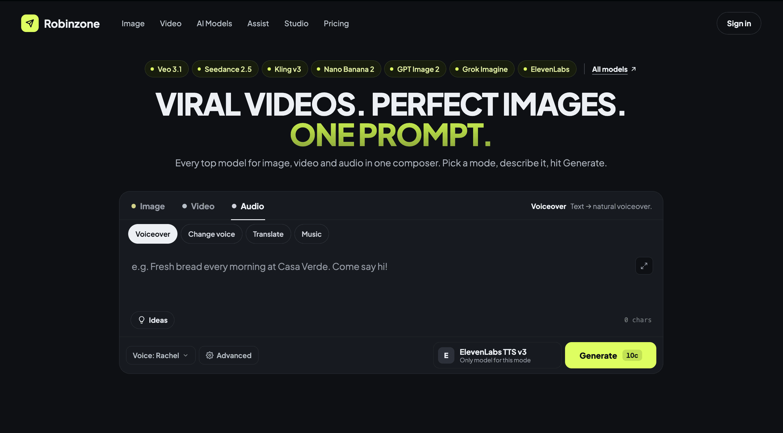
Desktop · after

Mobile · after
Next steps
Research plan and next improvements
01
Pricing clarity
Explain plans and credits clearly. The annual plan doesn’t show the final cost, though it’s billed yearly.
03
Auto model
Test automatic choice of the model that fits the prompt.
05
UX writing
Rework the copy so it’s clear to non-technical users.
07
Homepage rethink
Review the rest of the homepage: which content and blocks are actually useful.
02
Free test generation
Validate the hypothesis and check technical limits and financial feasibility.
04
Studio blocks
Reduce cognitive load in Image Studio and Video Studio.
06
Ideas button
With text or an image already added, ideas ignore them. Hypothesis: users expect Ideas to build on what they entered.
Key takeaway
Most competitors lead with a list of models. Robinzone can lead with a scenario — a working composer on the first screen that gets a beginner to the first result.
© 2026 Adel Lein, UX/UI Product Designer
Telegram
Behance
Robinzone · AI platform · Web
A clear way into creating
Robinzone brings 61 AI models from 10 providers into one subscription. Its homepage opened with two entry points that competed with each other: a hero with link cards and, below it, a working composer with 11 modes. I redesigned the first screen so a visitor understands the product, sees what they can make and starts creating right away.
6
competitors
analyzed
6
UX issues
found
5
iterations with AI
· 17 fixes
6
hypotheses
to validate
This case is available only on desktop, mobile version is in progress